

OVERVIEW
Industry
Team
30+
PHASES
Discovery, Research, Ideate, Validate, Delivery
Duration
1 year
CONTEXT
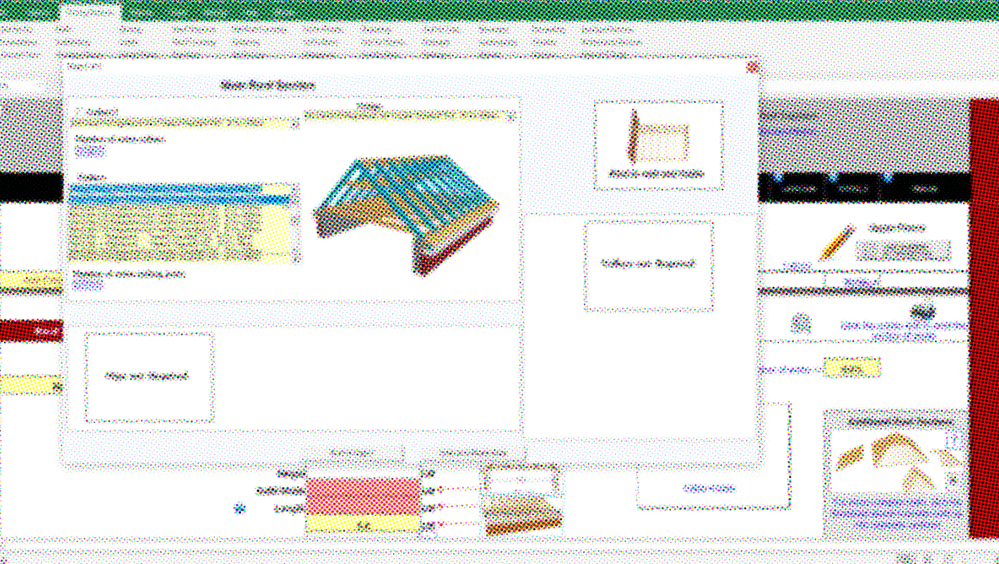
The tool started as an Excel-based system used by a small group of experts. It could calculate materials, labour, equipment hire, project costs, schedules and final reports, but it was difficult for new people to understand without long onboarding. It also did not look like a product that could be easily shown, sold or used by wider teams.
MY ROLE
I worked as a UI designer in a product design team led by an experienced design director.
I supported early discovery and vision work, helped prepare interactive prototypes for testing, and later designed the full UI for the web platform, including key screens, states, reusable patterns and handoff materials.
CHALLENGE
01 /
The brand existed, but the product UI did not. The style guide showed how the brand should look in marketing, but it did not answer product questions: how pages should be built, how tables and forms should work, and how the same visual language should scale across calculators, editors, reports, etc.
KEY DECISIONS
01 /
Extended the brand for product use
I extended the system with UI-friendly color variants, text styles, and the product components the brand did not cover.
02 /
Reserved bright brand colors for accents only
Applied across the full interface, the brand felt loud and distracting for complex calculations. I kept the base calm and used bright colors only for accents and chart color coding.

03 /
Make printed reports readable
I was designing the interface view for material reports when a developer asked me to help with print styles. After many layout tweaks and print tests, portrait A4 still made the tables too small to read. I proposed switching the printed report to landscape A4, and this direction was approved.


CHALLENGE 2
Because of timeline shifts and long approval loops, development had to start before usability testing was finished. This meant the UI had to support two tracks at the same time: stay clear enough for developers to build, but flexible enough to change after testing.
KEY DECISIONS
01 /
The product was scoped with no mobile support. I built a modular grid and the rules the whole interface followed. I designed unique screens only, and developers used the test screens as a reference for the rest. My scope did not cover pixel-perfect implementation.

02 /
Designing and supporting all flow variations for 30+ developers in parallel with prototype testing was not possible. The BAs added requirements on top of the same screens, combined parts from different screens into one, attached the relevant spec, and linked to a test prototype for an overview of the tested scenario. I drew exceptions as static screens, without full flows.
The original tool


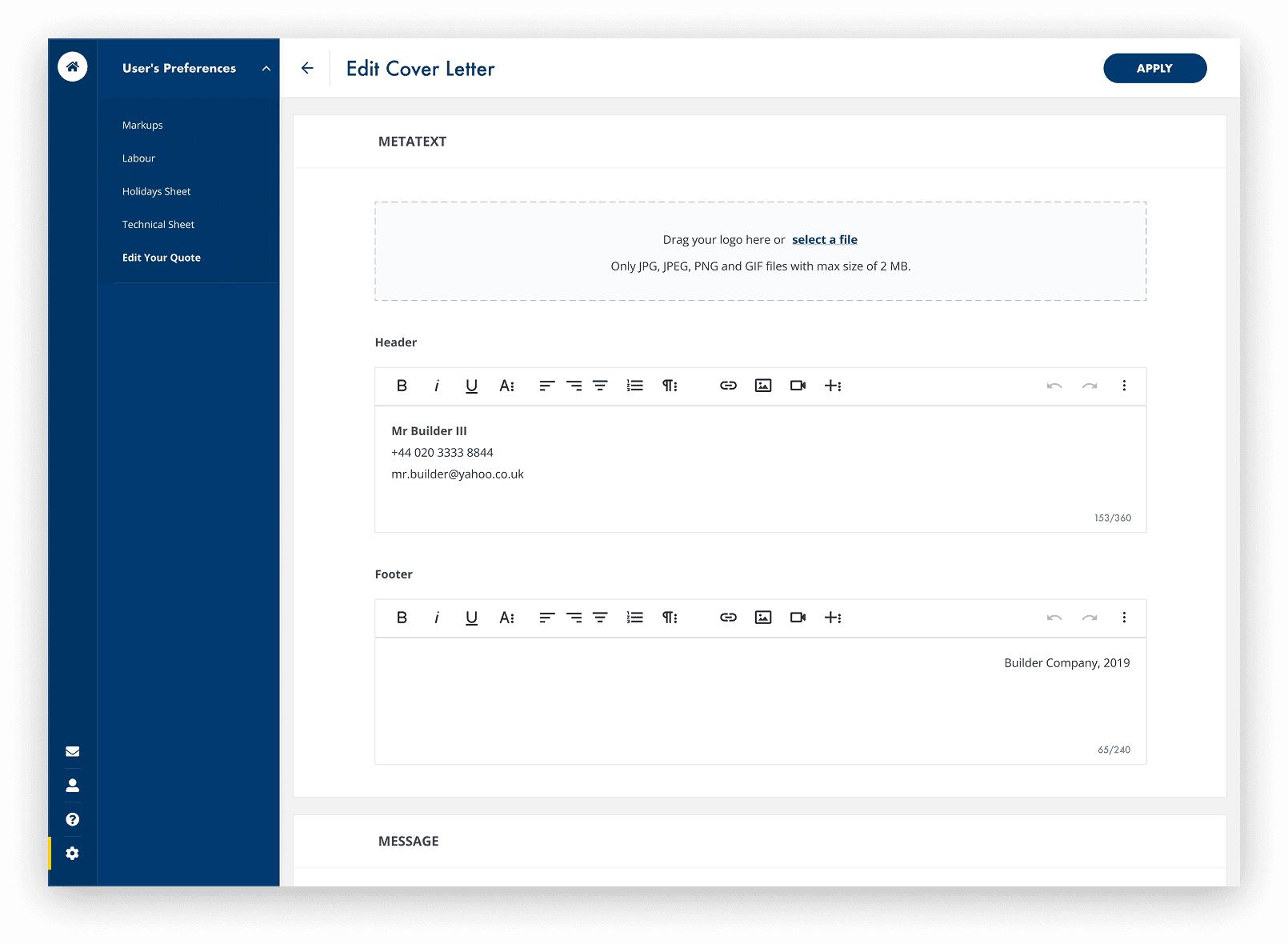
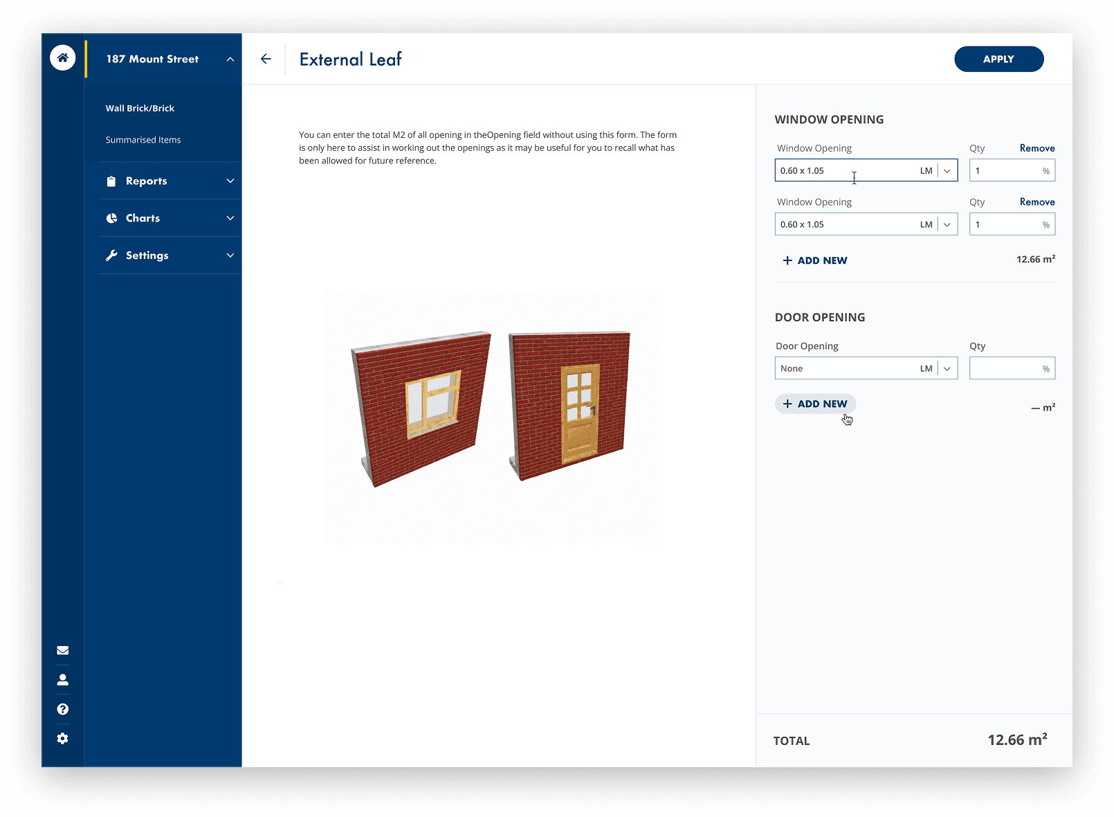
Final screens



What I'd do differently
I would ask for more time on the pattern base. The product had many interface patterns: form builders, admin tools, formula logic, reports, charts etc. They needed foundation work before development, not in parallel.